We have released Related Content
We are looking for feedback and first impressions. Please add any feedback on in the thread below.
This feedback will be considered by the product team for our first round of updates in the coming weeks.
Please note, this is not a place for submitting bugs. If you are encountering a bug, please file a report in app via 'submit a bug' in the bottom left settings menu in your Tana workspace.
9 Comments
It seems that a "when empty" mode can be added for related content, which would make it much cleaner. (In addition, it feels like an option for default collapse could also be added, as some people may have such a need.)
Like that feature very much! E.g. if taking notes in a meeting for a project, I now have all open ToDos as related content.
Love this. I would certainly enjoy placement at the top of the page, too, as an option. It's subtly shaded separately enough that it would be useful for a few things to have directly at the top. My current day's to-do list is generally short enough that it doesn't take up too much room and I want it to be pretty front and center. I love the calendar view to the left, but it takes up a lot of space, so anything else I add there just scrolls off the bottom of the page. Having the ability to anchor it to the top will ensure I don't miss it.
This feature is awesome with so much potential once semantic search is a thing in Tana.
But unfortunately, it triggers many search nodes on zooming on a node, so performance suffers and my old PC crawls. I know you probably are always working towards making a snappier Tana, but also think in the short term, maybe there are simple things like allowing related content to show up collapsed by default (like mentioned by @江sir爱数码 above) or returning only the first results with a "load more" option...
I'm not sure about this but it seems like the Related Content searches are even "more alive" than other searches, like if they update more frequently and are constantly sucking up CPU resources... is that a fact/issue?
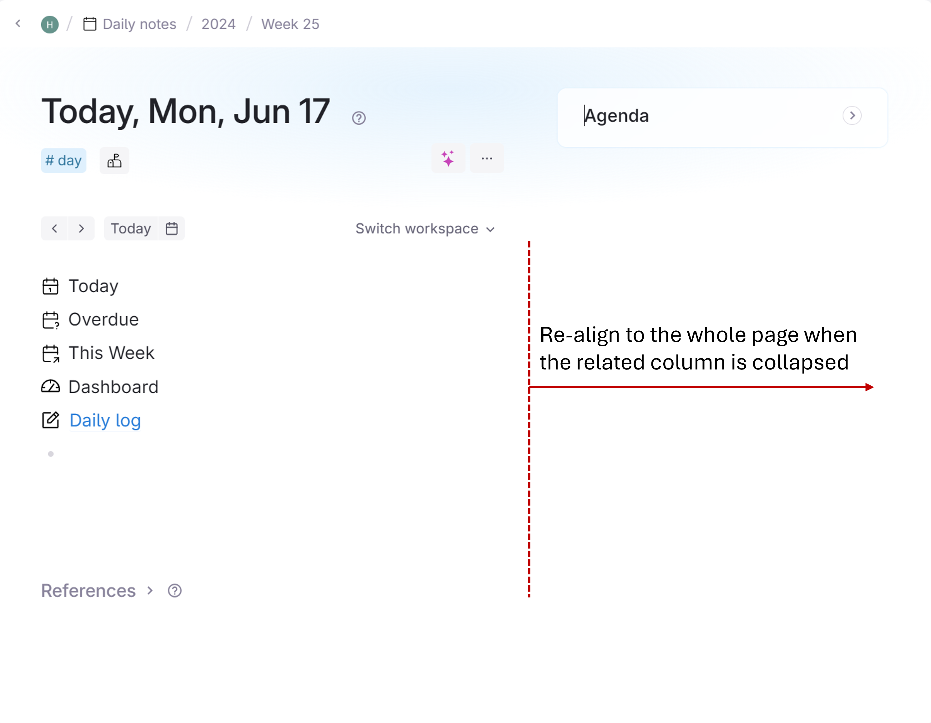
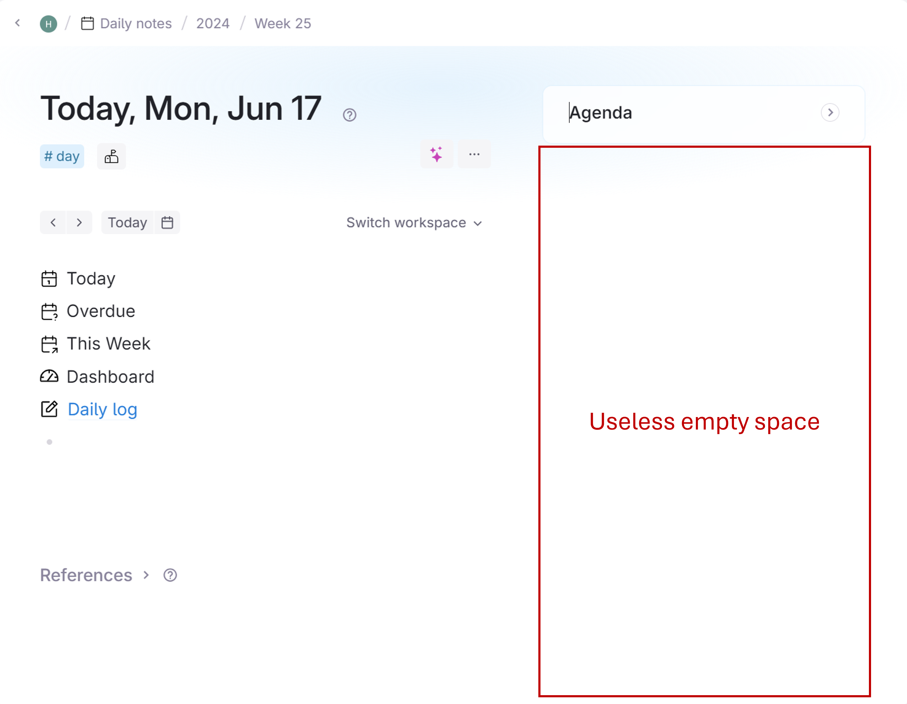
The related content column is very useful if we would like to reference some related information. However, it also takes up a lot of horizontal places even when it's collapsed. Could the related content column only show up when the Tana Window width is above a certain width? or when the column collapses, could it release the space that was saved for the related content? In this case, we can focus on the current page/node without sacrificing the spaces or being distracted by the huge empty white place on the right. Thanks for your help and happy to elaborate more.

Another improvement I think can make sense is to move right aligned Related Content to bottom when we're using side panels.
I love the content being on the right because it doesn't get in the way of my thoughts, what I'm writing at the moment. But when I have a side panel open, my eyes are going back and forth between the panels. And in this context, the Related Content is sitting right in the way and clutters my thinking. So when I'm using side panels, I'd prefer Right-aligned content to move to bottom to keep it clear from where I'm actively working.
I accidentally deleted the "Agenda" area. Is there any way to restore it? (I tried configuring it according to the "Related Content" in the guide, but it didn't work.)
Been able to hide related content (specially the one on the right) would be wonderful. Sometimes I'm taking notes on a narrow window and I don't need related content to be preset. The only way is "move to bottom" but it's complex (require a lot of clicks if you have some related-content elements) and I want to have it back when I resize my window.
An "easy" idea would be to have a button tu hide all related content until you click again to make them appear back on place