evyatar gefen
evyatar gefen's Comments
-
-
In reply to Maciej SmołaMaciej Smoła
Aug 27, 2023 I just felt the biggest reason why I would like to have an easier way for long form writing, strictly meaning multiline nodes. It’s because there is no way to tag many nodes at once in a good fashion...Totally agree.
I would like to add that adding the ability to tag many nodes at the same time is not a sufficient workarround.
A single multi line node is not the same as multiple nodes writen one after another.
Sometimes, multiple lines add up to a whole, and each line only makes sense as part of that whole.
Every time a line is tagged, the other lines should be tagged as well. Every time a value is writen to a field of a line, the same value should be copied to the sme field of all other lines. Every time a line is referenced, the other lines should be referenced as well, and the reference should be ordered one after the other exactly in the right order.
An example:An explanation that includes a diagram. In many cases, the explanation is structured in the following way: a simle explanation of the idea, a diagram, and then further elaboration. Right now, this explanation is forced to be split between at least 3 nodes, even though it is a single explanation. If I want to reference this explanation, I can't, I can only reference parts of it. I am forced to either reference all the nodes that the explanation contains and order them correctly, or reference only one node and hope that everyone looking at the reference will understand that it's partial and that they need to look at the original node.
I also agree that having a "title node" in the cases I presented is also not a sufficient workarround.
Some things don't have a title. I find that forcing the users to title things creates what I like to call "Title Hell", where you write everything that you want, but you are not finished because you cannot find an appropriate title for it.
It is frustrating, and it makes you resist writing, because you know that after you are finished with writing the things you acctualy want to write, you also have to do "chores" and choose a title for it.
And the worse part is that ussually the titles are worthless. You never use them when you search for what you wrote. And they convey so litle about the accual content that you have to constantly alias then whenever you use then as a reference anyway. -
In reply to Asaf DafnaAsaf Dafna
May 4, 2023 Another resource (from Roam Mixed Text Direction plugin) I'll be happy to help as much as I canI must say that I used this plugin in roam and that it works very well.
Nevertheless, I must also add that I'm not a fan of the "mixed direction approach".
It creates some weird situations when you have to change the way you write things so the text is aligned properly.
For example, many times, even when writing in RTL languages, you need to start a sentence with an English word. If text is align accorsing to the first letter of the sentence (which is what the "mixed direction" approach means), than it is not possible to start a sentence with an English word, even though you want to.
In my opinion, it's not a good idea for the app to limit the way people write just to enforce artificial rules, such as aliging the direction of the text based on the first letter of the sentence.Moreover, I must say that I also disagree with the notion of relating the alignment of a node on the screen to its content.
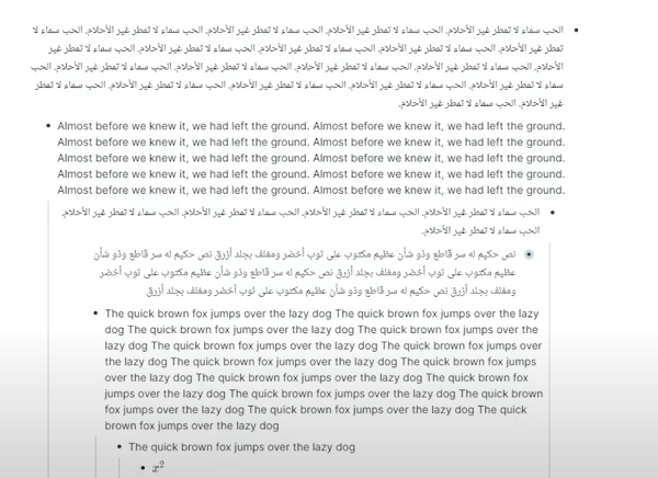
I'll give an example from the tutorial of the "Mixed Text Direction" Plugin:
As you can see, the screen contains a few block (in roam) such that some blocks are in Arabic and some are in English.
The blocks writen in arabic not only have their text align from right to left, but have the "dot" aligned from rigth to left.
I do not see any reason why the two things should be related.In my opinion, the appropriate solution should be to allow a user to align the entire app from right to left or from left to right. This would mean that all the "dots" (and the dots" only) are aligned from right to left.
I recently discovered that roam added this capability, and it works very well (and it is way more comfortable than the plugin).As to the alignment of text within a node - this should not be related in any way to where the "dot" appears on the screen.
The "dot" might appear on the right side of the screen, but the text may be alignt from left to right (or from right to left).
That is something that roam does not do, and it can be annoying. The content of each block should be like an entirly independent word file, where the user can write whatever he wants however he wants.The "dots" are only a way of presenting the different nodes in a convinient way next to each other on the screen. I don't see how flipping them from one side to the other all the time is helpful, and it even might be harmful.
As to users who still want to switch the "dots" from one side to the other - I would wait and see wether the implementation I suggested is not enough for them. I don't see a reason to create a complex system of text and "dot" alignments before making sure that it is necessary. The implementation I suggest is way simpler to implement, and it solves a lot of the problems that RTL users have in existing apps.
So, it might be good to take a look at the plugin to get an impression how to present RTL languages, but I believe that copying the design would be a mistake.
-
In reply to Ricardo GaviriaRicardo Gaviria
Apr 15, 2023 I fully support this idea, in fact I know it can be implemented pretty elegantly on a TFT like Tana because it is possible in Roam. In roam you can use this plugin (https://github.com/digitalmaster/...I must say that although this sounds like an interesting idea, I have my doubts about the roam research approach.
The most notable problem that I see is the usage of the nesting mechanism to structure flashcards.
The way I see it, there are 2 types of flashcards:- Cards that are created from existing content without changing it
- Cards that are created by writing content just in order to create the cards.
The broblem is this - the nesting model does not make any sense for any of the types.
For the first type, well, it cannot be created at all.
Lets say that you have an existing node, from which you want to create a flashcard.
If the content is not formated according to the nesting model, than you just can't make it into a flashcard without rewriting what you wrote, or creating new nodes that are formatted correctly. In both cases, you need to write new content just to make the flashcards, which means that the cards are of type 2.
So what if the node is formatted according to the nesting model? This would mean that you had to anticipate in advanced that what you wrote would someday become a flashcard, and you formatted it accordingly. And I say "formatted it acordingly" because nobody naturally writes according to the nesting model. So again, you fotmatted your text the way you did just so you can create a flashcard out of it, which again, means that it is of type 2.I also want to add that I think that is a terrible idea to limit the way you format your ideas just because you might want to create in the future some flashcards related to what you write. You should write things in a way that expresses your ideas in the most accurate way, and I don't see why the way flashcards are formatted in the app should get in your way.
The reason I wrote all of this is because the underlying argument made by the nesting model advocated (and implicitely made here to") is that it is just "so simple" to create flashcards this way. You can just add a tag to you wxisting content, and you have a flashcard. But as I home I have shown, this problem is more complex.
So what about the 2nd type of flashcards? Why shouldn't you use the nesting model for them? Well, why should you? I don't see any reason why nesting nodes one under the other is more visually compelling than any of the alternatives.
It is more simple from a UI standpoint, as you don't really need to develop a new UI for flashcards, but, I think that you should choose the best solution for the users, not the laziest solution.I do beleive that spaced repitition is an important feature, but I don't think that this is the solution.
In my opinion, flashcards should be completely seperated from the knowledge management aspect of the app, with different UI options and everything. And after this is done, you should find ways to reduse the time it takes to create flashcards out of existing content. For example, to allow a user to mark text and create a prompyt/answer from it.
Start from type 2 flashcards, and move towards type 1 in the future. I really don't see any way to do it the roam research way without suffering from significant drawbacks -
Completely agree.
For me, this featue is a real deal breaker.The way I see it, every node should be like a single document. You should be able to write freely, with no constraints on the formatting within a node. This includes writing multiple lines in a single node, adding a mixture of lines and pictures, etc.
In my opinion, the node heirarchy should be used to express or visualize the relationship between nodes, and should not be a way to format content.
I think that the main problem with current apps, like Obsidian and RoamResearch is that they don't balance well the need for formatting and the need to visualize relationship between nodes in a comfortable way.
Obsidian solves the problem presented here, as every note there can be formatted independently, without forcing the user to split the note into multiple bullet point.
But it lacks the advantage of visualy presenting multiple related notes next to each other on the screen, or presenting one note under another note.
RoamResearch suffers the exact same problem presented in here, and this is the main reason shy I don't use it.To sum up, this is a really important feature, that will set Tana even further apart from other apps
-
I must say that I find this integration to be more powerful the other way arround.
Tana should be where information is created, as its data model allows you to link every node (in this case, tasks and events) in a very powerful way.
When you create an event, you will want to connect it to other nodes in Tana (like a project the event is part of), otherwise, why would you need the integration in the first place (you could just have event in google calendar and other things in Tana).
I think it makes much more sense to create events from Tana and have them sync to Google calendar than the other way around. Since we can agree that if you want to sync an event to Tana, you also want to connect it to other nodes in Tana, the proccess of creating an event will be as followed:- Go to google calendar and create an event
- Go to Tana app
- Wait until the event syncs to Tana
- Find the event that you created
- Connect the event to other nodes in Tana
When we reverse the integration, the proccess is as followed:
- Create a node in Tana that is maked as an event (part of creating a node is also connecting it to other nodes)
And thats it. The event will be synced to google calendar and you will be able to see it from the google calendar app.
This way, you can capture all the relevant information without even leaving the Tana app, and take advantage of the superior UI of google calendar to view the events in a comfortable way.
-
Hi,
I would like to add here the feature request I opened in the past about RTL support in the slack channel.https://tanacommunity.slack.com/archives/C02DAJB4XTM/p1675276992685879
I gave there an example of the problem and proposed one way to design the app for RTL users.
Hi,
I would like to share some kind of workaround.
The following CSS currently changes most of the app to RTL.
You can use a chrome extention called "Stylebot" to alter the css of the app.
This currently does not work for Code Nodes (haven't managed to figure out how this work yet...).
This should work for now, but I do not know if it is stable and will work after they release new features.
/* Change Nodes to appear from right to left */
.listItems {
direction: rtl;
}
/* Change sub nodes indent to be from the right and not from the left*/
.OutlinerItem-module_children__9oZW1 > div:first-of-type {
margin-left: 0rem;
margin-right: calc(var(--levelIndent) * 1);
}
/* Change toggle to appear to the right of the nodes */
.Bullet-module_chevronContainer__G4LBL {
right: -1.4rem;
left: calc(100% + var(--listItemHorizontalSpacing));
}
/* Change title text direction */
.listContentItem {
direction: rtl;
}
/* Fixing tag spacing */
.wrapEditableAndMenu:has([data-role=template-list]) .editable {
margin-right: 0em;
margin-left: 0.35em;
}
.TemplateTag-module_tagPrefix__fUBU4 {
padding-left: 0rem;
padding-right: 0.25rem;
text-align: center;
border-top-right-radius: var(--tagRadius);
border-bottom-right-radius: var(--tagRadius);
}
.TemplateTag-module_tag__8TbLO {
padding-right: 0.2rem;
padding-left: 0.25rem;
border-top-right-radius: var(--tagRadius);
border-bottom-right-radius: var(--tagRadius);
}
/* Moved Opened reference box text direction to the right */
.InlineInfoNodes-module_scroller__JUpAO {
direction: rtl;
}
I must say that I do not have a lot of experience with CSS and it still only took me a couple of hours, without even understanding the source code. I do not see how this would take very long for pro front end developers to develop.
Hope this can help someone.
For me it stills does not make the app good enough to use as it might stop working every day. Hope that it might be usefull to someone else.
Hope that some day this feature will be implemented so we can acually use the app!