I must say that I used this plugin in roam and that it works very well.
Nevertheless, I must also add that I'm not a fan of the "mixed direction approach".
It creates some weird situations when you have to change the way you write things so the text is aligned properly.
For example, many times, even when writing in RTL languages, you need to start a sentence with an English word. If text is align accorsing to the first letter of the sentence (which is what the "mixed direction" approach means), than it is not possible to start a sentence with an English word, even though you want to.
In my opinion, it's not a good idea for the app to limit the way people write just to enforce artificial rules, such as aliging the direction of the text based on the first letter of the sentence.
Moreover, I must say that I also disagree with the notion of relating the alignment of a node on the screen to its content.
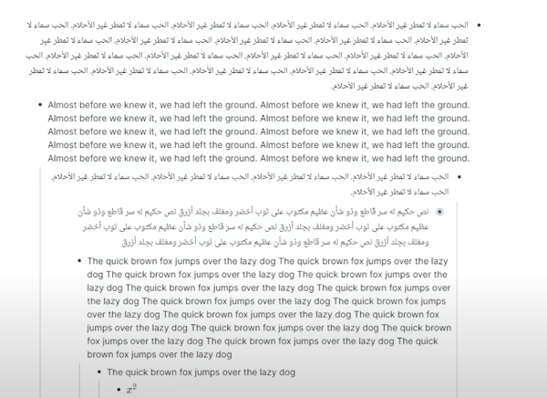
I'll give an example from the tutorial of the "Mixed Text Direction" Plugin:

As you can see, the screen contains a few block (in roam) such that some blocks are in Arabic and some are in English.
The blocks writen in arabic not only have their text align from right to left, but have the "dot" aligned from rigth to left.
I do not see any reason why the two things should be related.
In my opinion, the appropriate solution should be to allow a user to align the entire app from right to left or from left to right. This would mean that all the "dots" (and the dots" only) are aligned from right to left.
I recently discovered that roam added this capability, and it works very well (and it is way more comfortable than the plugin).
As to the alignment of text within a node - this should not be related in any way to where the "dot" appears on the screen.
The "dot" might appear on the right side of the screen, but the text may be alignt from left to right (or from right to left).
That is something that roam does not do, and it can be annoying. The content of each block should be like an entirly independent word file, where the user can write whatever he wants however he wants.
The "dots" are only a way of presenting the different nodes in a convinient way next to each other on the screen. I don't see how flipping them from one side to the other all the time is helpful, and it even might be harmful.
As to users who still want to switch the "dots" from one side to the other - I would wait and see wether the implementation I suggested is not enough for them. I don't see a reason to create a complex system of text and "dot" alignments before making sure that it is necessary. The implementation I suggest is way simpler to implement, and it solves a lot of the problems that RTL users have in existing apps.
So, it might be good to take a look at the plugin to get an impression how to present RTL languages, but I believe that copying the design would be a mistake.
The dot is a visual indicator, the requested feature does not have to implement this change of alignment but I think it's helpful.
Also, keep in mind that the screenshot you attached was made for demonstration purposes, switching language each node is not a common use case...
I disagree with this point - there are things I write in English (e.g. work and research) and there are things I (want to) write in Hebrew (e.g. personal and household stuff), I don't want to switch instances off the app any time I want to switch language. BTW, this capability in Roam is quite old, the Mixed Text Direction plugin was created to overcome this problem.
In my opinion, the appropriate solution should be to allow a user to align each node (and its children) from right to left or from left to right. The default alignment (LTR or RTL) should be determined in the global settings.