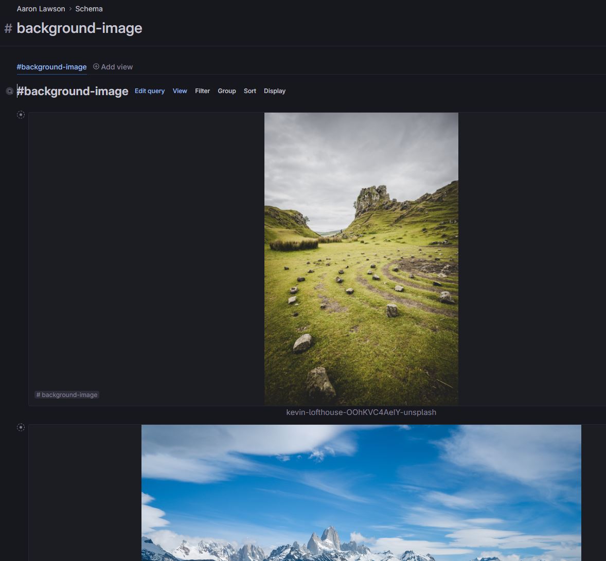
We have released a new update to images in Tana.
We are looking for feedback and first impressions. Please add any feedback on in the thread below.
This feedback will be considered by the product team for our first round of updates in the coming weeks.
Please note, this is not a place for submitting bugs. If you are encountering a bug, please file a report in app via 'submit a bug' in the bottom left settings menu in your Tana workspace.
13 Comments
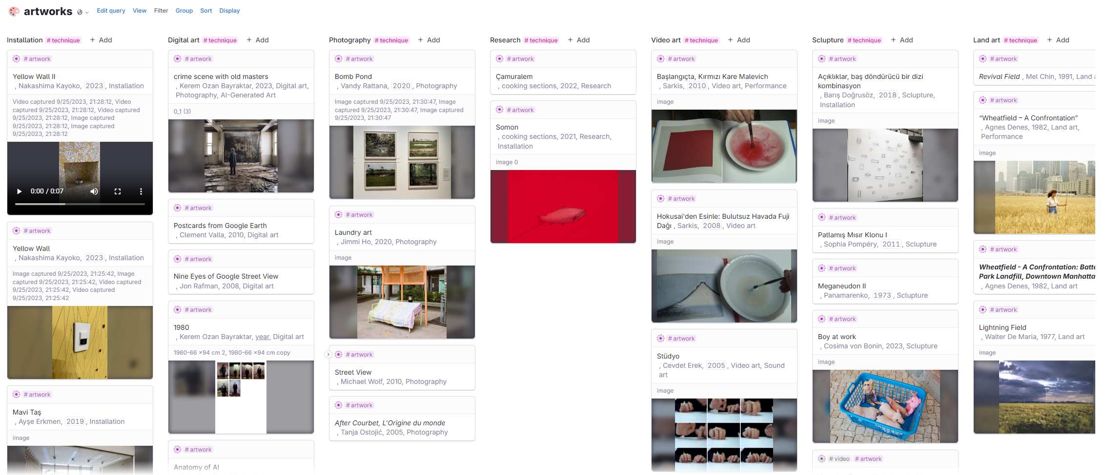
I appreciate the attention given to images. Tana makes a wonderful place to store and tag images. This update however did not seem to touch the 'Card view' at all, which is the main way I view images. I upload images to the 'today' node and tag them (#image tag which has sub tags for things like #3d, #diagram, etc). Then to view them I'll use a search node with the 'Card view'. Card view feels bare bones at the moment and is missing things such as display size and more attractive stacking options rather than display every image in a neat row. See apps like 'Walling' for how they attractively display a wall of images.
We need a utility to store and load a library of randomized 'banner images of the day'.
I'm currently doing this with a manual method and it greatly enhances the user experience of making the Daily Page in Tana part of a user habit and routine.
We need support for 16:9 banner image creation or cropping
Image embeds need to be optional or removable, so that we can view them as a list; this would match the current function of video embeds.
Thanks!

The prompt for a generated image is lost as soon as we close the dialog, unless we selected and copied the prompt first. Can we have an option or command button to save the prompt as the image caption; or perhaps make the prompt the caption by default?
Edit: I've noticed that all the images I created with DALL-E prior to the 30 November 2023 have been modified to add the prompts I used at that time into the Caption. And, if I use the older "Generate Image(s) with DALL-E" after selecting text in a node, then the caption is added based on that text. So, perhaps my request is only for images created with the new image dialog
As someone who works with lots of visuals I appreciate the large image format.

Regarding the AI image generation window, my initial instinct was to utilize nodes or Tana search within the prompt textbar. I'm accustomed to using the search function and copying and pasting nodes extensively in Tana, and I hoped to apply a similar method, or something more complex like a prompt workbench where we can design our prompts in this context as well.
I agree with the comments of Nick Thompson about the card view thumbnails. An auto crop or auto size function would be great as well because they look quite ugly with blurred background (please see the attachment)
Additionally, I'd like the ability to designate any image as a "banner image."
A potential future improvement could be the integration of a slideshow in Tana & Publish. This would be particularly beneficial for classroom use, as I have increasingly incorporated Tana Publish in educational settings.
Thanks a lot!
In dark mode, images will automatically reduce brightness.
Being able to collapse or minimize nodes with images would contribute significantly to a cleaner and more streamlined workspace. If possible, I would love to see an option in future updates that allows it, providing greater flexibility and organization within the platform.
Please add support for SVG images. Right now they are treated as attachments and you have to run
cmd+K Convert legacy image to new image formatevery time.I also like your attention to images, they can be a powerful feature to make Tana beautiful.
I didn't get the philosophy behind the change, though. What use case is that aimed towards? This full-width, centered approach, really doesn't match my use cases. All images I add to a page (except banners) are there to be complemented by text (or to be complementary to text), so I don't want the image to be stretched out to fill the whole page and push most text out of view, while having to fill its lateral gaps with a blur, just wasting space. I would humbly ask you rethink this approach.
When images are not there to be complemented by text, I would say they are to be showcased together (like cards view, or walled images, etc).
Can we have a quick option to copy the image (transfer to clipboard)? In the zoomed node, the right click is being hijacked and we don't get a "copy image" among the options.
So, first of all I wanted to say congratulations on this new feature. I imagine it probably works great for many of the most central use cases, and I also imagine that you never intended it to be the final word for all use cases. I also imagine that it might be useful for you to know about concrete use cases where it perhaps does not work quite so well, so in that spirit I thought I'd explain in depth something I am using Tana for.
I do appreciate that this is going to sound extremely niche, and in its specifics it is. But I also think it exemplifies a more general pattern that might be exemplified by people who use diagrams or flow charts to document particular sorts of things — network diagrams or project management flowcharts for example.
Apologies in advance for the length of this post, but I think I need first explain as briefly as I can what it is I am doing. I've been an amateur drummer for decades, and over that time I have amassed a huge collection of exercises, rudiments (short sticking patterns that are like the alphabet for drummers), and rhythms and grooves, mostly jotted down on scraps of paper. These are all short musical phrases, often just a couple of bars long, not sheets and sheets of music. I am slowly engraving them all in Dorico, and exporting as SVGs which I then import into Tana where I tag them and classify them, write notes, and relate them together. Unfortunately, the new image format is not working so well for this.
The first problem is that tag names are displayed on top of the images, often making them hard to read:
Even worse, in cards view for some reason the tag name is repeated, once above the image and once again on top of the image, this time almost completely obscuring the musical notes themselves:
Second, the name is displayed in a muted grey colour, centred beneath the image. I'm sure this works well for captions of images which are like floats in a longer document, but when it is supposed to be the title of something it's actually quite hard to read:
The tag name is far more prominent in the screenshot above than the actual name of the node. This is made worse when a node is expanded:
Here the title, 50 Ways to Leave Your Lover, is almost completely obscured by the image above and the fields below. (And note that again, the tag name obscures part of the music.)
Returning to the screenshot before the one above, the centred layout is odd here. Music is always left-aligned, and it feels really odd for me to read them like that. The enforced centring here is not an insurmountable difficulty, but it makes things harder to read comfortably.
Finally, when you zoom into a node it looks like this:
I'm not quite sure what is constraining the height, as the image is an SVG and so presumably lacks an intrinsic height. As it is, the image is a little small.
It seems to me that the best way around this is for you to add a small number of built-in image layouts, rather than just one. I am not suggesting adding endless user configuration options, I dislike that idea almost as much as you probably do. But a few curated layouts (less than a handful) designed by the Tana design team surely could cover most eventualities. One which left-aligned the image, had the title and tag on the same line, left-aligned also, and which set the title in a brighter colour would work perfectly for me, and I'm sure others too.
Another option might be to have different layouts depending on whether an image was tagged or not.
Thanks for taking the time to read this.
SVG images work now as of web@256.0.2! Thank you.
Can we have an option to see the image full screen? when images are smaller, like in side panel nodes for instance, and you want to see the details, a button that expands and overlays the image in the whole screen would be great to quickly see the image, maybe even zoom in a part of the image, then press esc to return without having to mess with panel layout.
Slightly off-topic, but still relating to images:
when I tag someone as a #person, I like to use a photo of the person as their banner image. The photo can come from anywhere, probably LinkedIn and can be any size. I need an auto fit imported image to banner option.
I would very much like an option to compress all banner images of a specific tag (#person) across_ one axis_ (the vertical for a person, since I want to see their head). There may be use cases for a horizontal fit, so that would be nice too.