Explain the problem as you see it
My Supertags are usually a combination of two different types of things:
- Fields for structure data
- Related Searches - where I can bring up things related to the item.
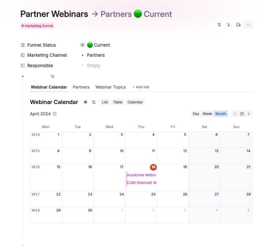
I like to view the related searches as tabs as I think it's more aesthetically pleasing and easier to navigate. But at the moment I have to add a node called "Related Items" and then nest each search under that node and then view as tabs. I feel having a node just so I can create tabs is a bit redundant.
Why is this a problem for you?
Having an extra heading just so I can view the tabs seems redundant. I feel like I should be able to see fields even when I have turned tab view on for a supertag (or any node)
Suggest a solution
What I think should happen is if you switch the view of the Supertag itself to Tabs. The fields should show at the top, with any nodes showing as tabs beneath.
Below is how I have been doing it by creating a blank heading node (so the node stays open) and then configuring the tabs under that heading node. I'd like to remove that heading node altogether and just have the tabs show up under the fields.

