This is an awesome feature and I am excited to see how it progresses! In terms of improvements, I would say:
- Allow me to turn individual nodes into heads to give better spacing between sections (rather than just paragraphs and quotes). I tried having a node with a table indented to add a heading, but the options there did not look good
- Allow for the width to be determined on a block level, rather than based on content. My tables look completely different and different widths, so they don't present well one after the other. Could just have the same full vs medium.
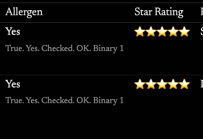
- Not sure why checkboxes show in tables with a little description of "True. Yes. Checked. OK. Binary 1". Maybe you are still deciding how to show it? But it feels pretty cumbersome in a table.
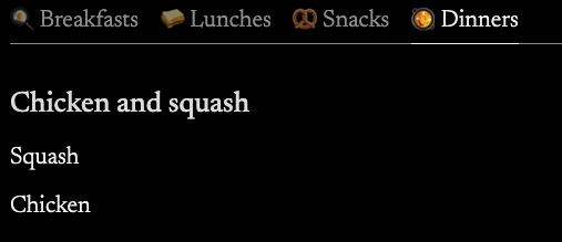
- Tabs with tables underneath just can't format in a nice way unless I turn the columns into quotes
- I would also say that the paragraph and heading being the same colours when in a table really shows no differentiation between the 2.
You guys did an amazing job! I truly am excited to be able to share more with the people around me, just thought I would let you know some of the little nitpicks I have found! Attached some screenshots to hopefully show some of what I have pointed out.


Great feedback Jess, have added to the team workspace!