Explain the problem as you see it
Regular nodes are a great canvas for writing and developing ideas. Super tags and fields are a great way to connect and query data.
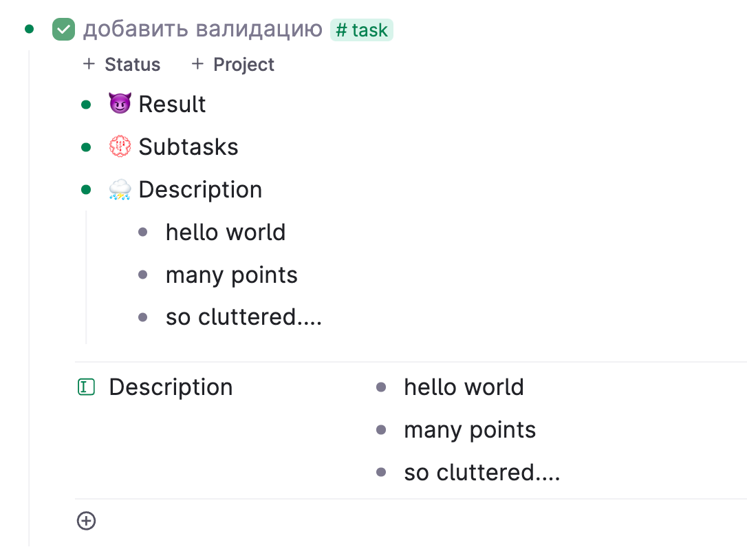
I would really like to remove the visual clutter of fields when I am writing in a child node of a super tag. I know I can 'hide fields', but in that scenario I need to unhide them one by one (slow) and they are not truly hidden (10 'hidden' fields still create lots of clutter.
Why is this a problem for you?
The clutter of fields decrease the low distraction power of the Tana interface.
Suggest a solution
I would love to be able to fully hide/unhide all fields of a node through the command line (and set a keyboard shortcut for this).

17 Comments
I've used up all my upvotes for the month, but I would also really like this. Maybe even a mode that you could switch in and out of that shows and hides all fields? Outliner vs database mode?
Yes, exactly. If there is a command line action, you could do so through a shortcut.
Yes, this is definitely needed.
Came here to request this same feature. Tana is really in need of a way to cut the visual clutter that fields produce. The outline gets a bit tough to follow once you start nesting nodes with fields visible.
From Slack:
Yes, I have been talking about this in several places in the Slack channel in recent months.
For Tana to really retain the power and provide the speed entry-/organizing features of an outliner, this outliner mode needs to be available.
It could be a mode to switch on and off, but the ideal would be to be able to switch it for a particular node, and it would then apply to all the subnodes in that hierarchy.
I need it for several use cases.
The most obvious one is when planning tasks and breaking them down to subtasks. I do this daily. Whenever I "get closer" on a task at the work to be done, I break it down further.
The task is a super tag with various fields. Even if most of them are hidden, it is still cluttering.
A concept of how it could work - functionally - is already visible in the way the editor handles contextual subnodes. (You create it by using Ctrl-Shift down-arrow).
When a contextual subnode has been inserted, you can cycle between showing the fields or not - using Ctrl-down arrow.
(But the use cases are not solved by simply using contextual subnodes all the time. It does not facilitate the automatic populating of fields based on ancestors etc.).
An big reason for me originally taking my task system out of task apps and into an outliner (WorkFlowy / Dynalist / Roam Research before Tana) is because of the speed of entry and (re-)organizing.
I agree. This solution would do away with a lot of the gymnastics people do to create their journals/habit trackers
Part of the problem is that both fields and subnodes are children of the parent node, and so as siblings are on the same level.
One solution could be to give all tagged nodes a child node called "fields" which could then be collapsed to hide them. I suppose it might then be awkward for fields to be grandchildren instead of just children.
Showing/editing fields could also be useful to display on hover, rather than the current breadcrumbs and created/edited dates.
I think this should be part of a larger discussion started in: https://ideas.tana.inc/posts/139-zen-markmodemark-distraction-free-full-screen-blank-page-editing - a "Zen" or "Focus" mode, where all extraneous UI elements are hidden.
I agree that is an annoyance in general, however, there is narrower sub-case of @Imre Vogelezang 's idea which particularly irks me, and that sub-case might have a simpler solution because it pertains specifically to semantic parent-of fields and drill-downs in parent-child tree. Let me try to explain...
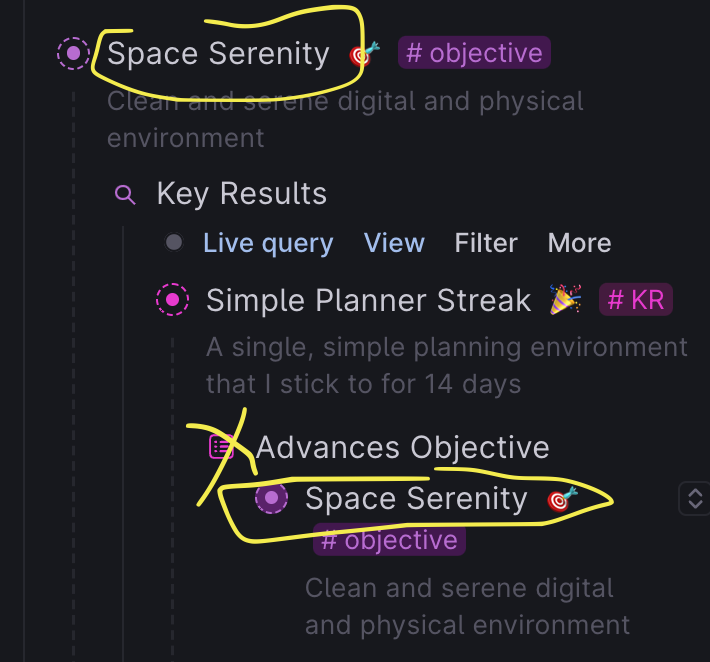
Depending on the current view context, I would like Tana to hide parent reference fields that have a semantic function and is referencing a parent in the viewing tre, because that is just uncessary visual clutter (in that view context)..
An illustration:

I REALLY would like something like would solve a LOT of these ugly awfulesses that often throws off my flow because of the duplicated reference in the above screenshot.
I still WOULD like to see the parent field when it's not part of me drilling down a tree, for example, when viewing the node from the example above in isolation like this, it's really nice to have the field as a navigation path to the parent:
For me, this is a bit related to this comment by Delgado on the Slack community:
I strongly agree with Davids quote - the related parentship is just a nicer model - but an accidental drawback from it right now (that makes me yearn for the outline model) is the extra clutter it adds to the visual space when you do drilldowns exemplified above.
Perhaps add an extra "When viewed as a child of parent" option here:
I quite agree with this problem, but I don't think simple concealment is the best solution.
I agree with @Chen both that there's a problem, and that there's a better way. Yes, it's a problem that you can't see a node's child nodes without also seeing that node's fields. I also think there's a better way.
I can think of a couple of features to add, but these are beyond the basics.
One would be to allow users to show selected fields as nodes with a colon between the field name and the field's value, like "Author: John Smith." A series of auto-complete steps in the ctrl+k menu would accomplish this. The user would ctrl+k on a field and then type out the following:
The last option would change a toggle on the field's configuration page.
My usecase is following. I love the ability to have a left-right structure of Field-Content. But I can't hide the field when I want it. So I go of "emulating" field with supertag's default nodes that I can hide. But they also feel like a clutter and I miss this left-right structure. Would love to have an option to dynamically hide the field content (move it to the state where "Project" field is right now).

Update: Now found an option called "Reset hide field state". It partially does what I need
Wanted to submit this / a similar request. Since "we" use fields & tags to build systems around what tana currently offers, there probably is a better way, i.e. solving many other problems that makes this go away with it. But in the meantime, I rely heavily on field usage with some of them being really technical to build structures. Those fields are no interest to the "user" during productive use of the system / structure.
I would like to see fields that are used under multiple supertags to be hideable by which supertag they are under. For example, if I have a date field, there are some supertags I would like to see when I open them. But others, I think it just gets in the way.
Returning to Tana lately, and definitely wishing this was resolved.
Same here, this is still an ongoing issue
There should definitely be an option to hide fields depending on zoom status. I prefer hiding them when zoomed out, since the tag indicates I can zoom in to see them. Others probably prefer to hide them when zoomed in.