Just so people know, i just complained about exactly this in the Slack Group:
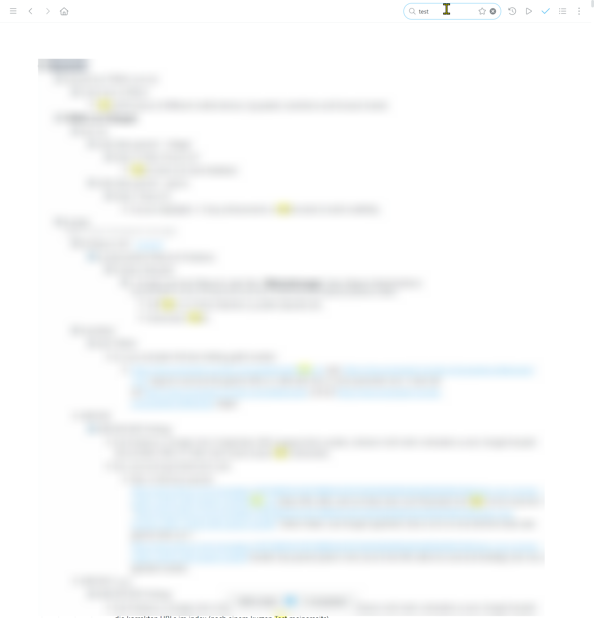
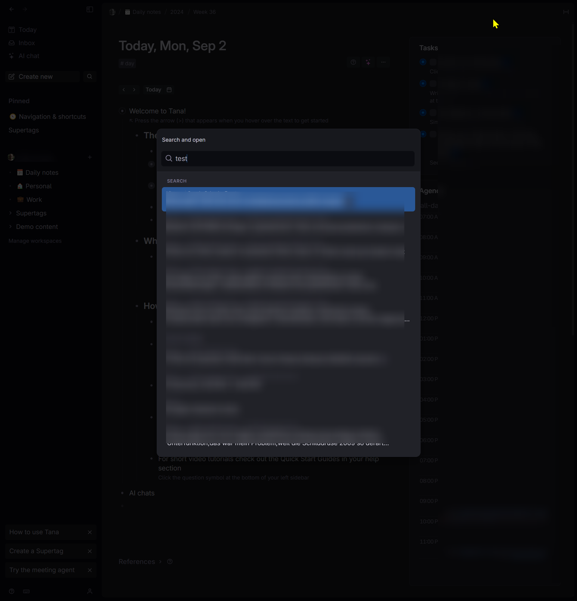
"I really dislike the tiny pop-up search box in Tana. In Workflowy, you get a large view of all the nodes when you search, which I find much more useful. I'm not sure if everyone knows what I mean, but I’ve included screenshots of both Tana and Workflowy for comparison. In Workflowy (white screen), you can see a large hierarchical list where the search term 'test' appears, making it much easier to see the context and position of the item you’re looking for."
Thanks for pointing me to this idea to upvote it :)
Workflowy (PERFECT!)
Tana (NOT GOOD!)
You don't have permission to do this.
You're going a bit too fast! Take a break and try again in a moment.
Something went wrong! Please reload the page and try again.
Your session has expired. Please reload the page and try again.
Just so people know, i just complained about exactly this in the Slack Group:
"I really dislike the tiny pop-up search box in Tana. In Workflowy, you get a large view of all the nodes when you search, which I find much more useful. I'm not sure if everyone knows what I mean, but I’ve included screenshots of both Tana and Workflowy for comparison. In Workflowy (white screen), you can see a large hierarchical list where the search term 'test' appears, making it much easier to see the context and position of the item you’re looking for."
Thanks for pointing me to this idea to upvote it :)
Workflowy (PERFECT!)

Tana (NOT GOOD!)
