

Explain the problem as you see it
As a knowledge graph, in my opinion, Tana far supersedes any other tool in the market. On the other hand, in terms of UI (user interface) relative to other tools, in my opinion, Tana has the worst look and feel experience; and Tana’s UX (user experience), while great, needs some improvement.
Why is this a problem for you?
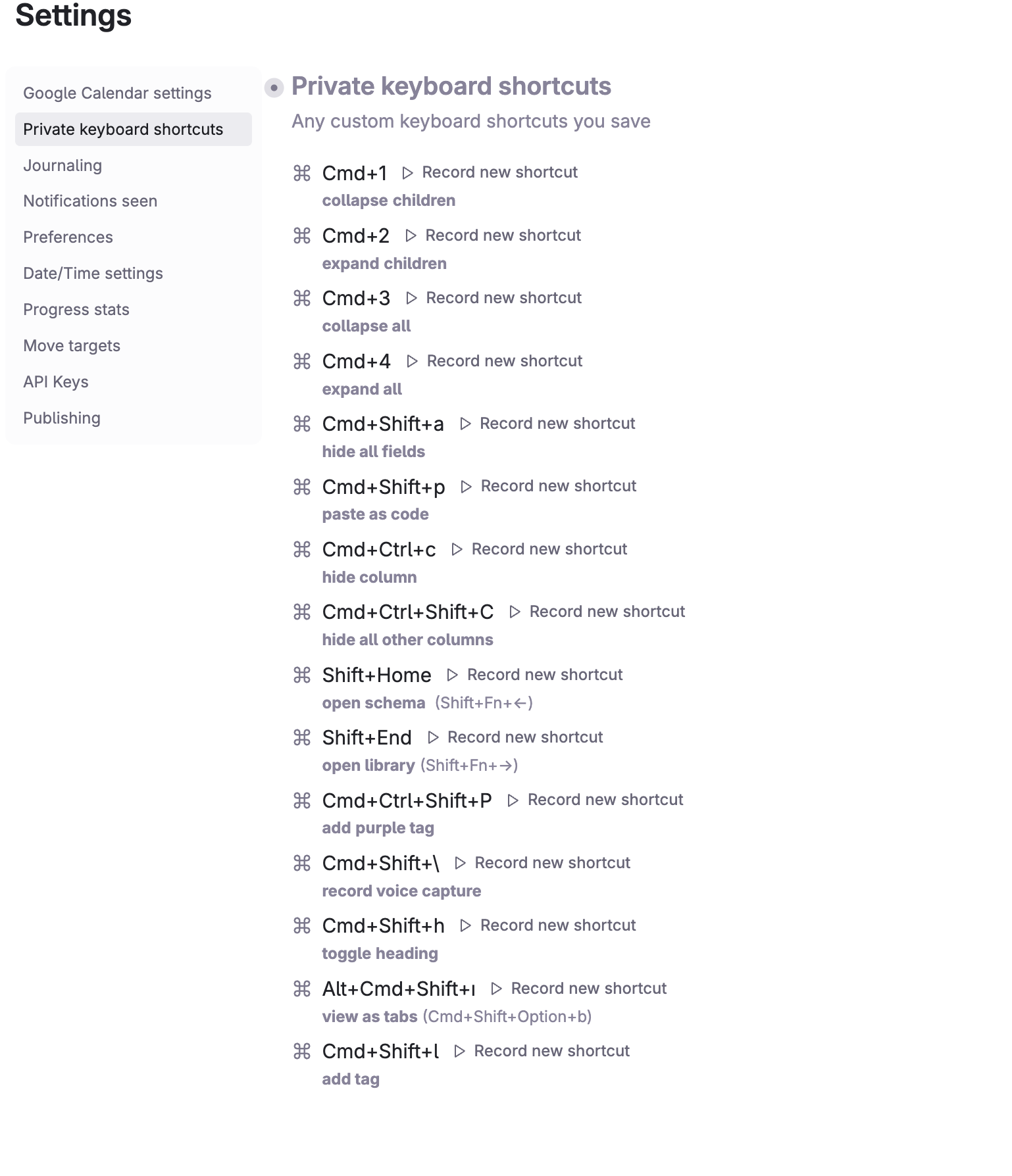
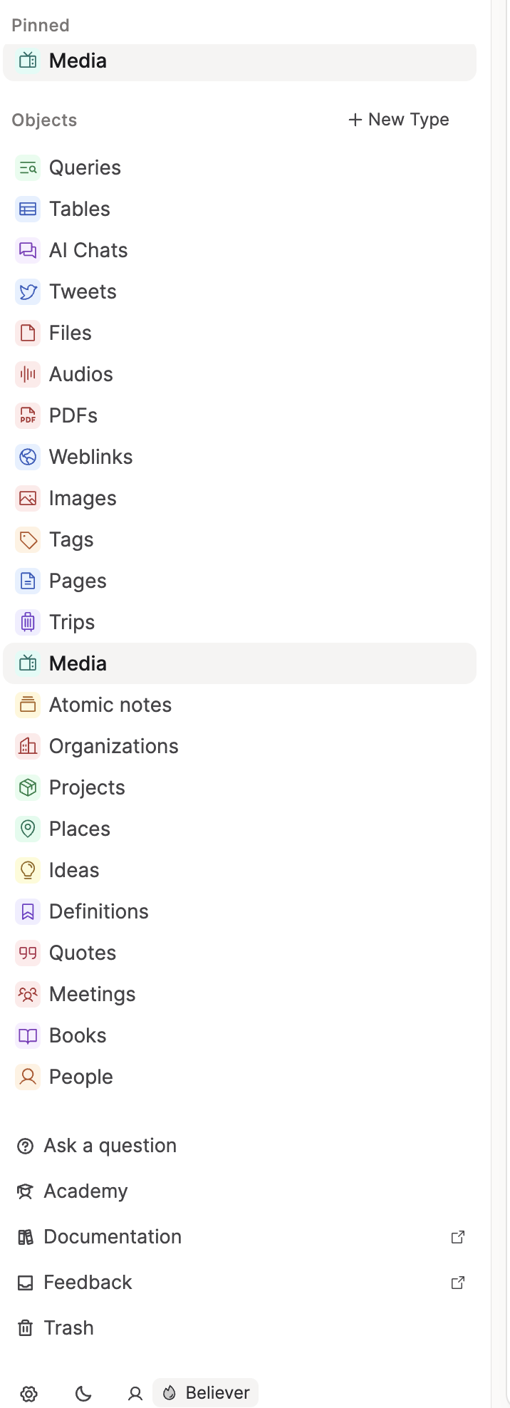
Tana's visual and interactive elements are not visually appealing. I've mentioned on Slack before that the design feels aesthetically unpleasant.
Just compare the attached images—look at Notion and Capacities versus Tana's window layout, menus, colors, buttons, icons, typography, and spacing.
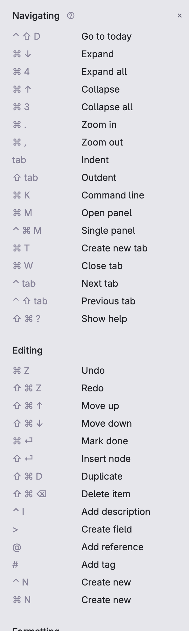
Tana UI:
Suggest a solution
I strongly recommend hiring a professional UI designer with experience in creating visually appealing, modern interfaces to improve how Tana looks and feels.
PS: thank you for your attention to this matter lol
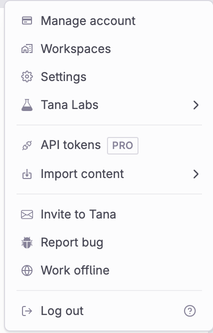
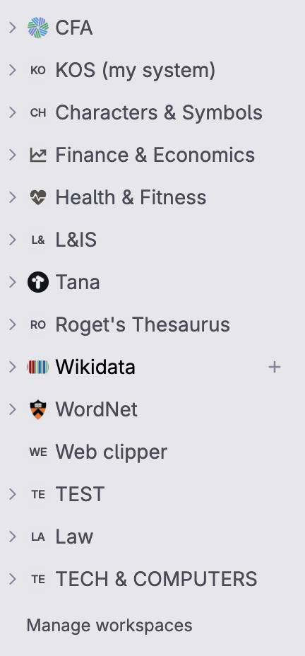
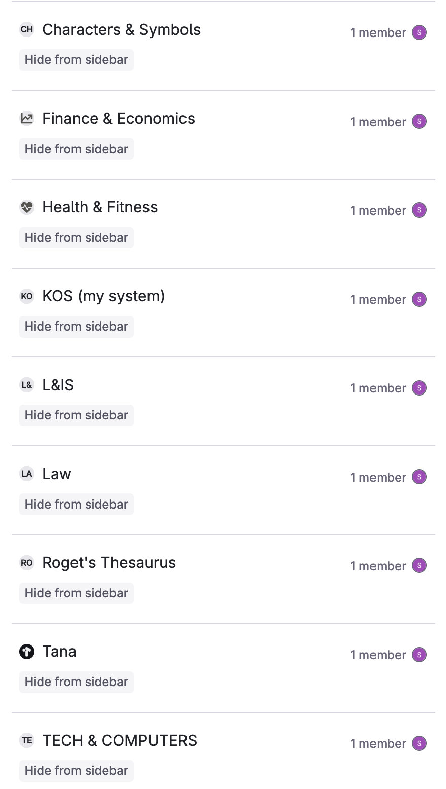
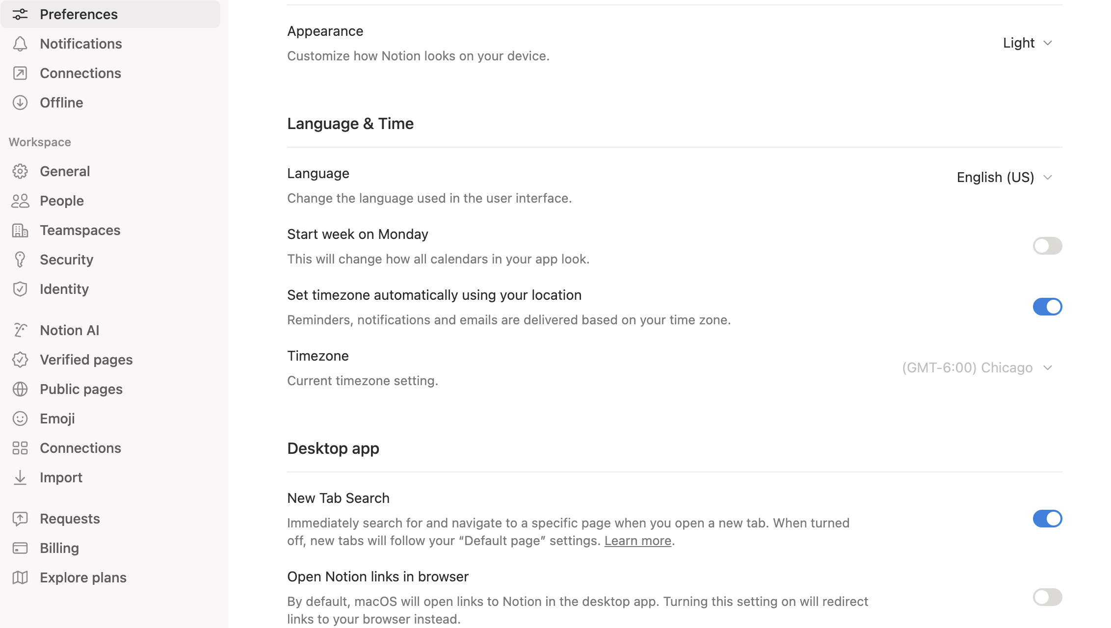
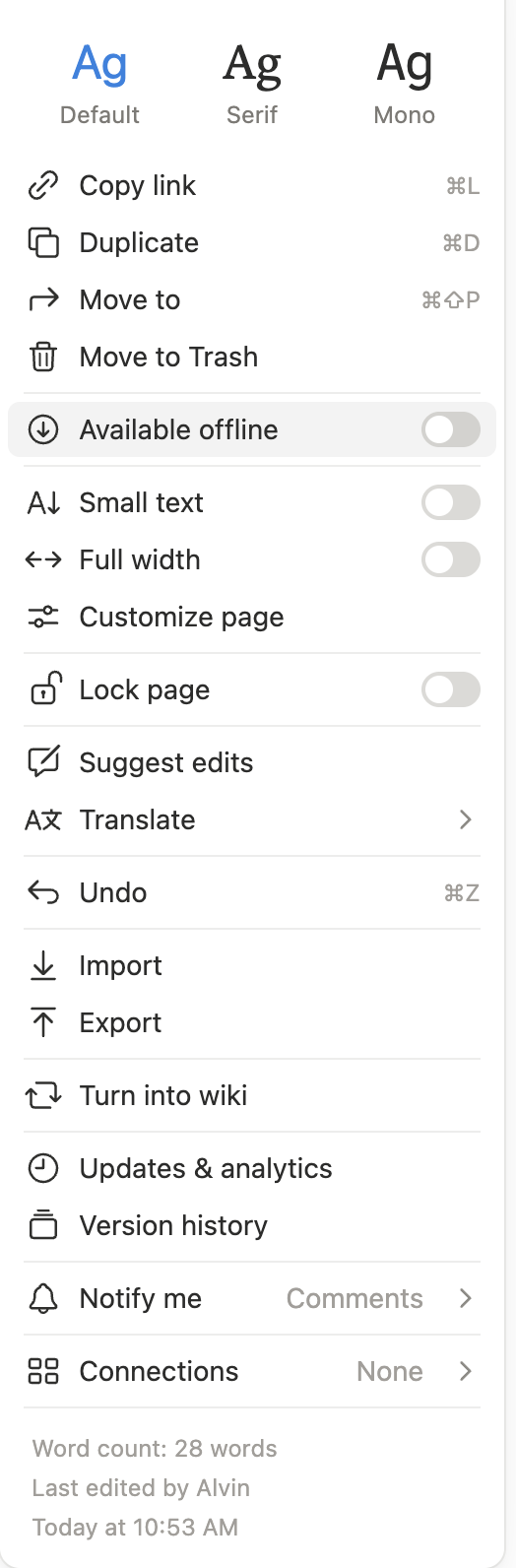
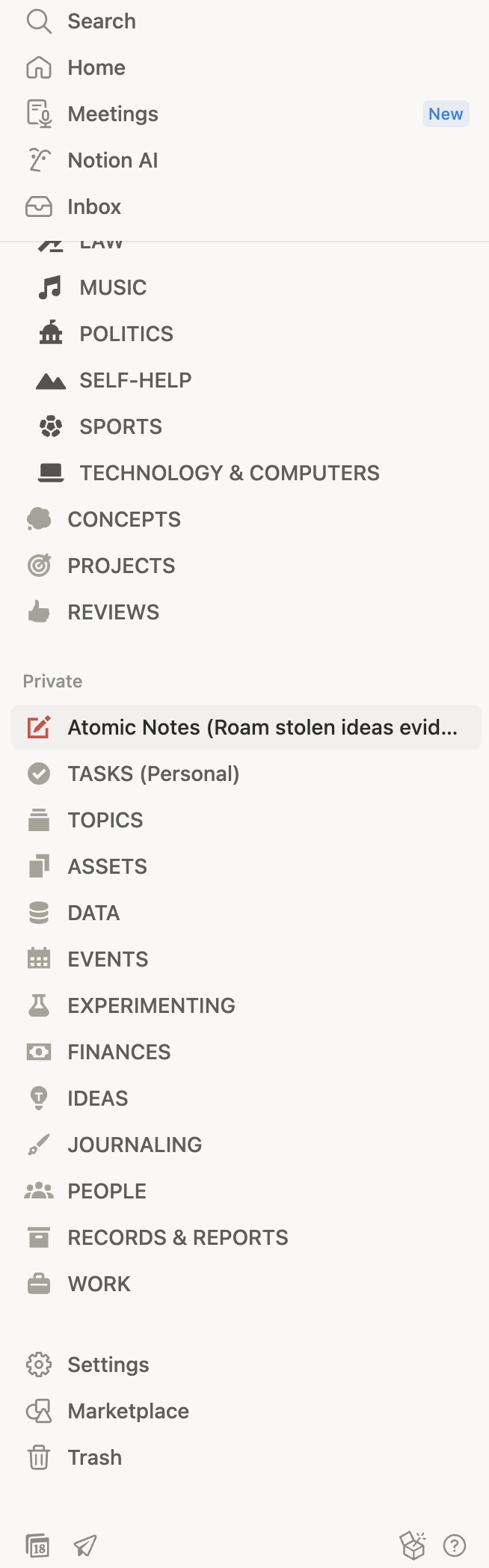
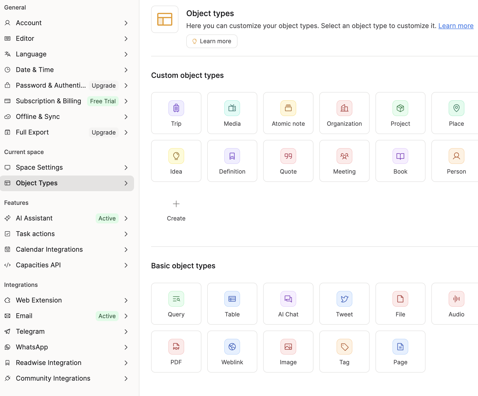
Notion & Capacities UI:
2 Comments
I just saw the update today. The warmer colors alone make a big difference.
Notion assimilates the shade from Apple Books's original Theme (and most apple apps, I think). Regardless, that shade has a perfect balance. Either way, great job guys, this is a great start!
I have a feeling Capacities is taking all my advice from here and implementing it themselves, ha! I like the appearance theme they released today. You guys can do it!