

Explain the problem as you see it
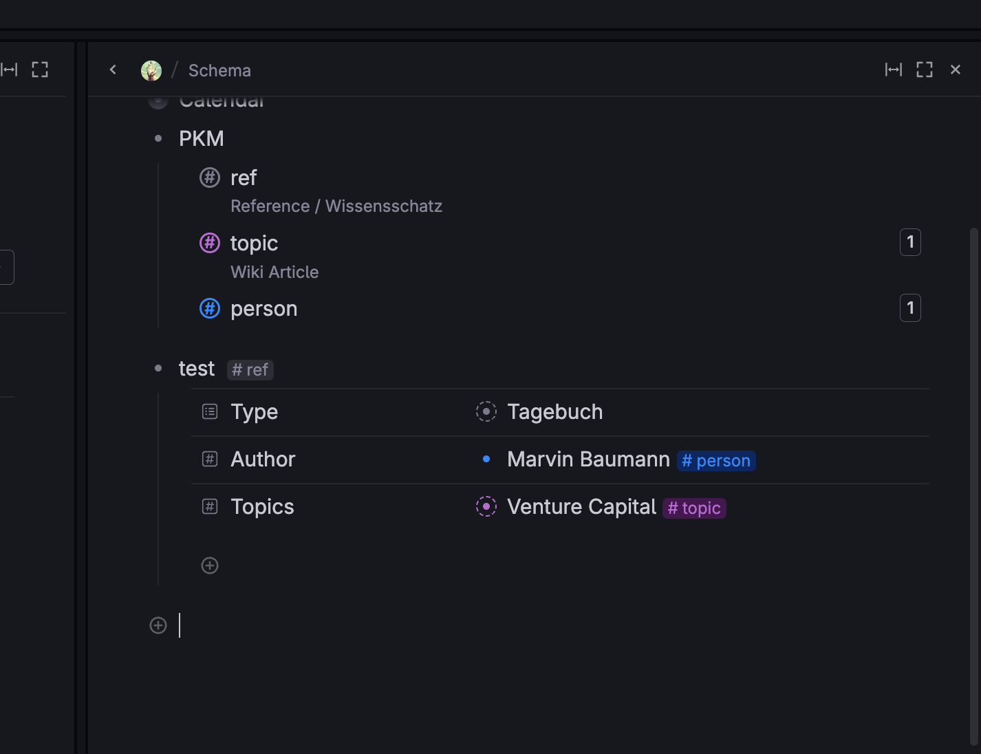
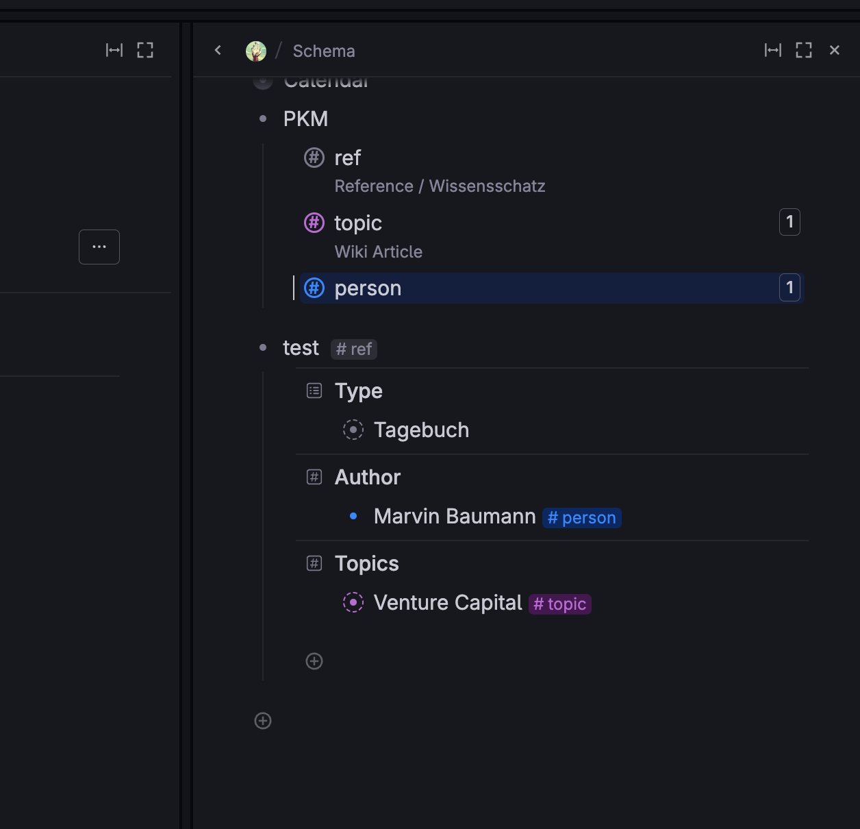
Tana sets nice margins left and right of nodes and right of field names, which look "clean" but are not strictly necessary and take up space. Also they lead to line breaks earlier than strictly necessary, see second picture where the field values would easily have fitted in a single line still, but because of these enforced margins the line breaks and vertical content volume is cut in half.
Why is this a problem for you?
The more we multitask in tana, to quickly jump between different views and locations of the knowledge graph (which might be connect in our minds but tana isn't as far yet in UX design to show it the way our brains do), the more we'd like to maximize what we can view in the windows. Some users might prefer less margins or actually find them cleaner to enable them to take up more content in a single monitor.
Suggest a solution
Add a new setting: Normal, Tight and Extremly Tight margins.