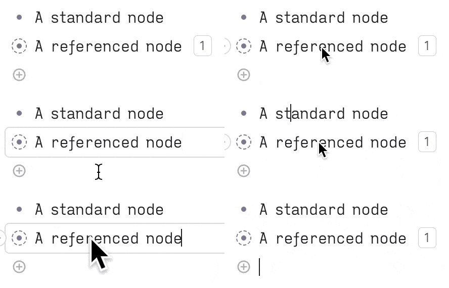
The styling, especially the subtle flash, behind the references is 
That said, I've noticed a slight dip in the ease of editing. Previously, it took just a single click to modify a specific part of a reference. Now, it requires 3 clicks since the input field only appears after either double-clicking or expanding the node. Admittedly, it's only 2 clicks if you expand the node instead of double clicking but I find myself doing that much less often.

Transclusions everywhere, as a first class feature, along with supertags, initially drew me to Tana. While I understand and appreciate the value of these new 'soft locks', they add a bit more resistance to my workflow than I'd prefer.
I'm sure there is some balance that can be achieved as the UX decisions y'all have made have been consistently strong. In the interim, having an option to disable the soft lock feature, perhaps accompanied by a playful warning similar to the one in Obsidian when switching to Vim mode indicating that it's destructive, would be fantastic.

I absolutely agree that it adds resistance. I don't quite understand the rationale behind it (for me at least it's solving a problem that didn't exist).
PS: What's that font?
You're absolutely right, seamless transclusions were the thing that differentiate Tana, the experience feels so effortless yet powerful.
To me, the combination of that simplicity and the uniform feel between UI elements was the best, now it feels like there's too many visual indicators on the screen to parse, ngl.