Explain the problem as you see it
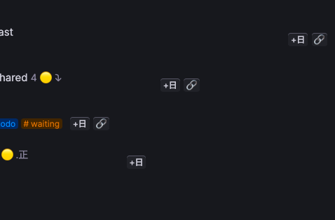
Currently, if I add a command button to a supertag it appears for all nodes with that supertag, however, the location where it appears varies wildly (see screenshot below):

Why is this a problem for you?
I want to simplify my view when working, and sometimes make every node, like a todo list, show up on only 1 line, but the buttons wrap or oddly space themselves so that's not possible
Suggest a solution
- Ideal: User setting for button alignment to specify freeform (current state), or aligned to end of tags, or other options
- Pretty good: auto-align to end of tags
- ??: Open to better ideas :)
