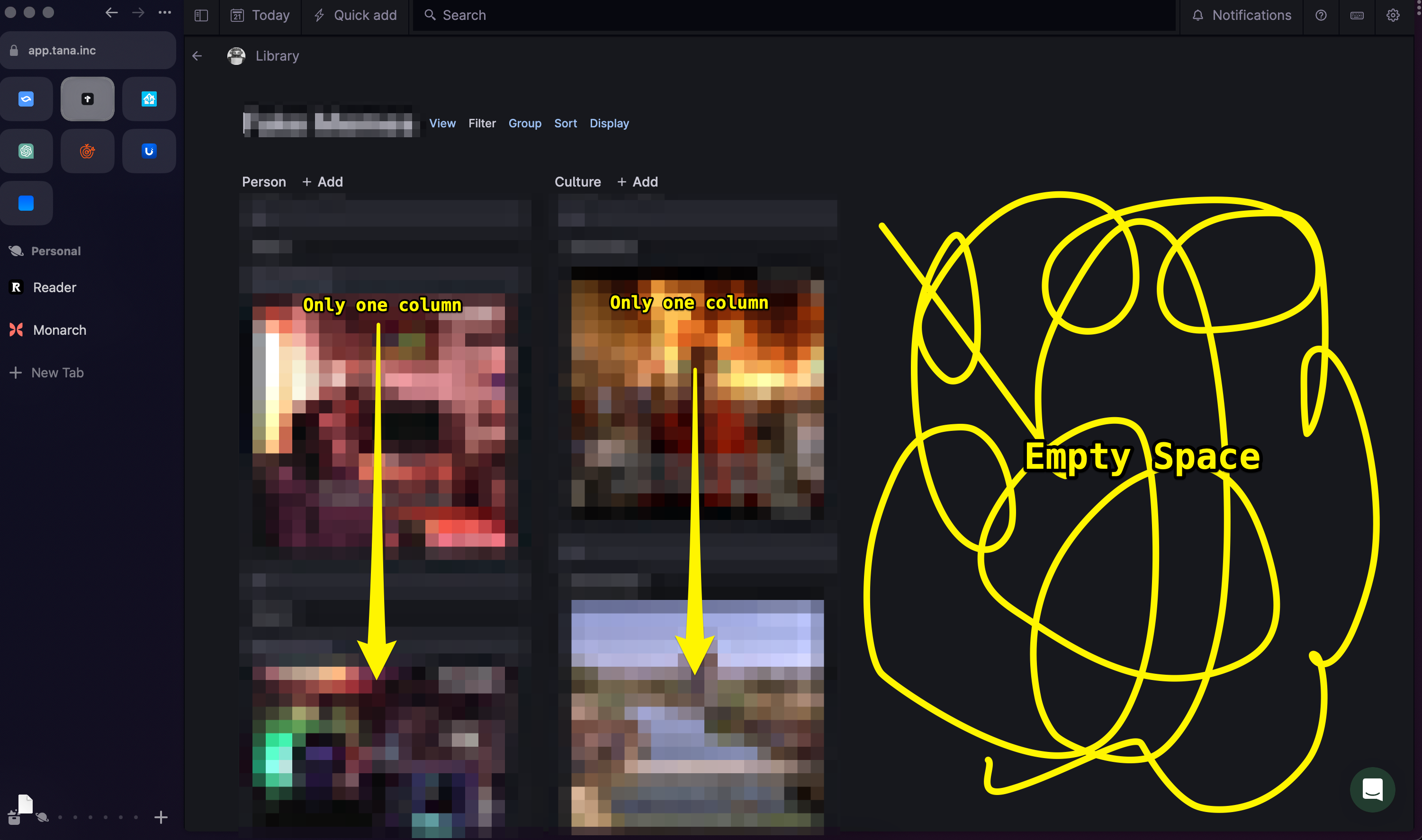
Explain the problem as you see it
As a tana user organizing a bunch of items in card view, employing “group” by a field, I expect the UI to make use of available space so that I can find what I’m looking for more easily
Workaround: I now have to scroll down a single column for multiple pages and half my screen is blank. I find the single column grouping less useful than just making two search nodes on the same page
Why is this a problem for you?

Suggest a solution
See above
